The following page documents visual specifications such as color, typography,
structure, and sizes.
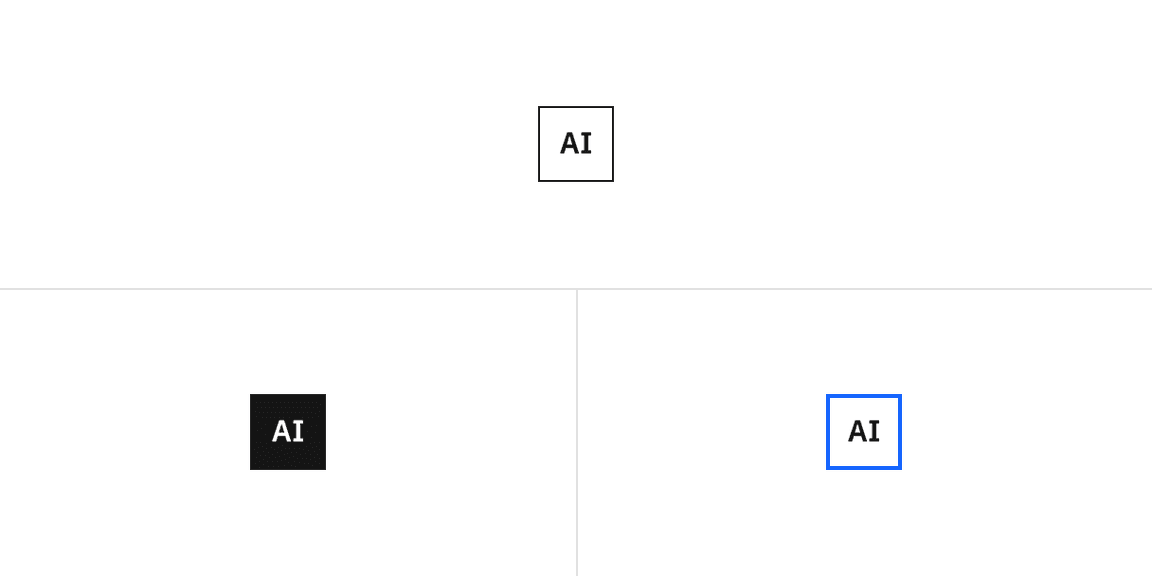
| State | Element | Property | Color token |
|---|
| Enabled | Text | text color | |
| Button | border | |
| | background | |
| Hover | Text | text color | |
| Button | border | |
| | background | |
| Focus | Button | border | |
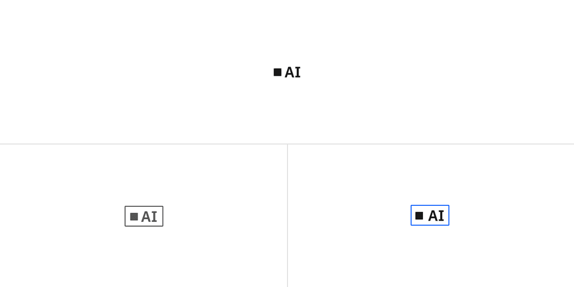
| State | Element | Property | Color token |
|---|
| Enabled | Text | text color | |
| Dot | fill | |
| Button | background | |
| Hover | Text | text color | |
| Button | border | |
| | background | |
| Focus | Button | border | |
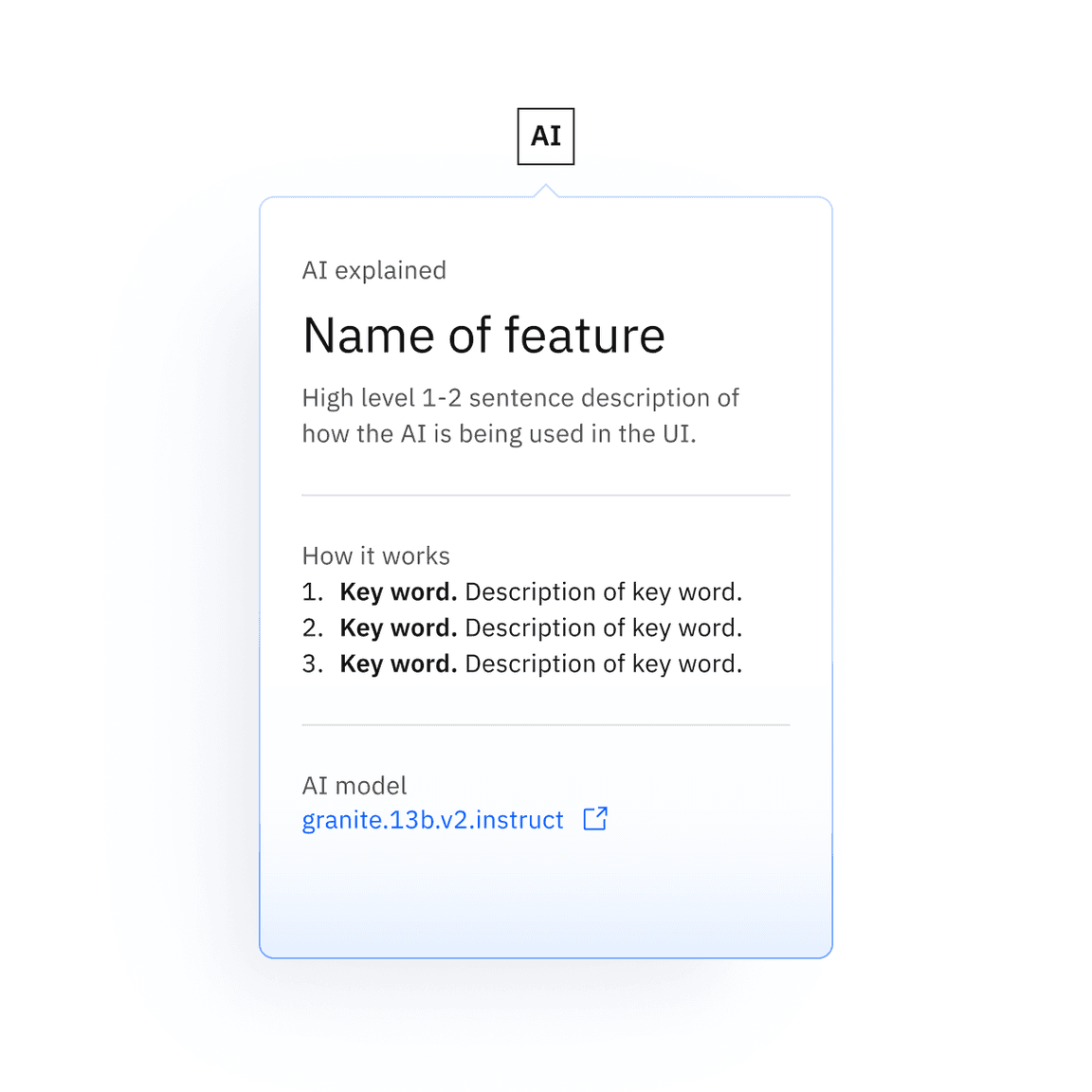
| Element | Property | Color token |
|---|
| Popover background | background | |
| linear-gradient: start | |
| linear-gradient: end | |
| Popover border | linear-gradient: start | |
| linear-gradient: end | |
| Element | Font-size (px/rem) | Font-weight | Type token |
|---|
| Text (xl) | 20 / 1.25 | SemiBold / 600 | |
| Text (sm–lg) | 16 / 1 | SemiBold / 600 | |
| Text (2xs–xs) | 12 / 0.75 | SemiBold / 600 | – |
| Text (mini) | 9 / 0.5625 | SemiBold / 600 | – |
| Element | Font-size (px/rem) | Font-weight | Type token |
|---|
| Text (lg) | 16 / 1 | SemiBold / 600 | |
| Text (md) | 14 / 0.875 | SemiBold / 600 | |
| Text (sm) | 12 / 0.75 | SemiBold / 600 | – |
| Element | Font-size (px/rem) | Font-weight | Type token |
|---|
| Text | 14 / 0.875 | Regular / 400 | |
| Title | 28 / 1.75 | Regular / 400 | |
| Body | 14 / 0.875 | Regular / 400 | |
| Element | Property | Value | Spacing token |
|---|
| Button | border | 1px | – |
| height | See sizes | – |
| Text | padding | centered | – |
Recommended structure and spacing measurements for default AI label | px / rem
| Element | Property | px/rem | Spacing token |
|---|
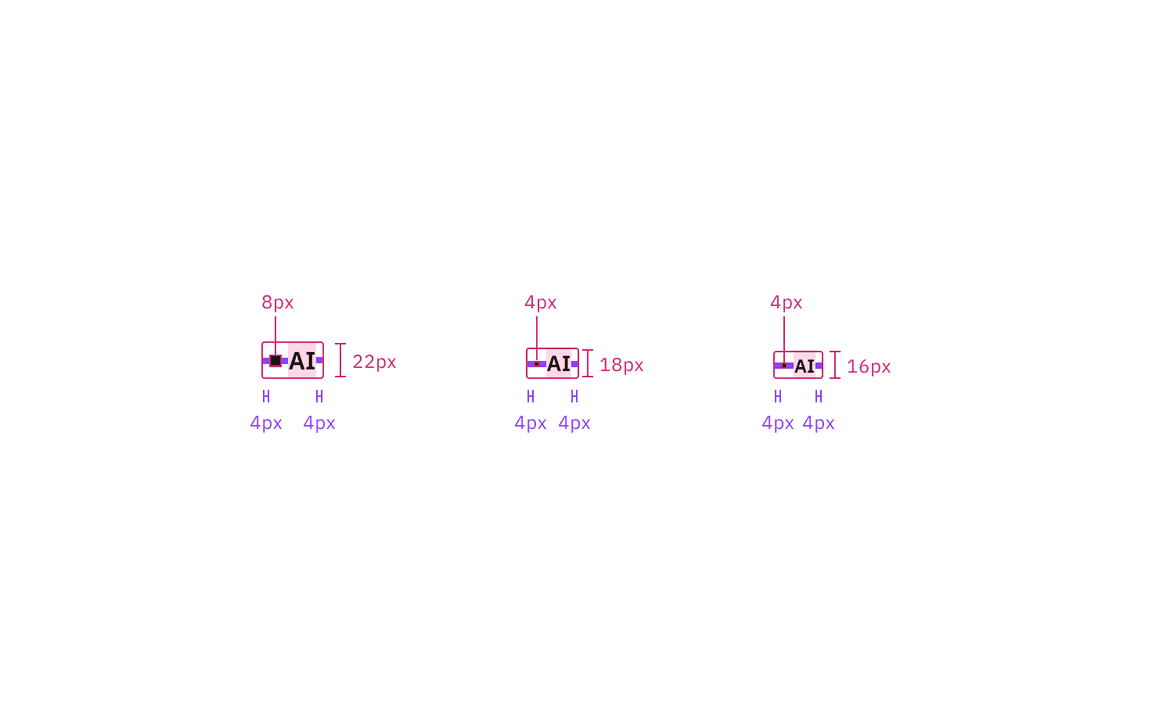
| Text | padding-left | 4px | |
| Button | border | 1px | – |
| padding-left, padding-right | 4px | |
| height | See sizes | – |
| Bullet (sm-md) | height, width | 4px | – |
| Bullet (lg) | height, width | 8px | – |
Recommended structure and spacing measurements for inline AI label | px / rem
| Element | Property | px/rem | Spacing token |
|---|
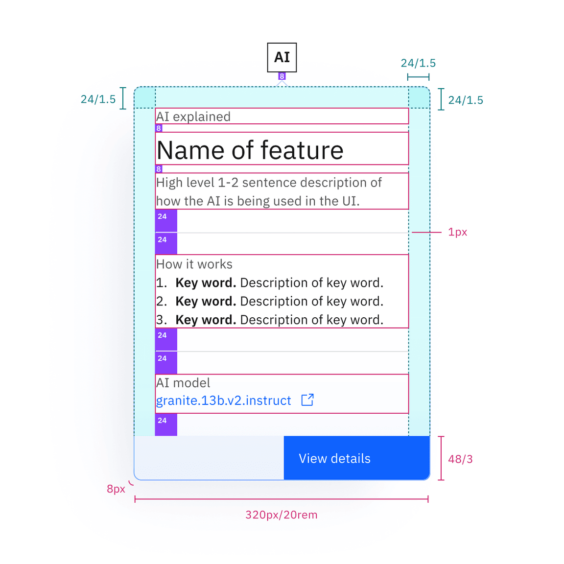
| Container | padding | 24px | |
| Footer | height | 48px | – |
Recommended structure and spacing measurements for the explainability popover
| px / rem
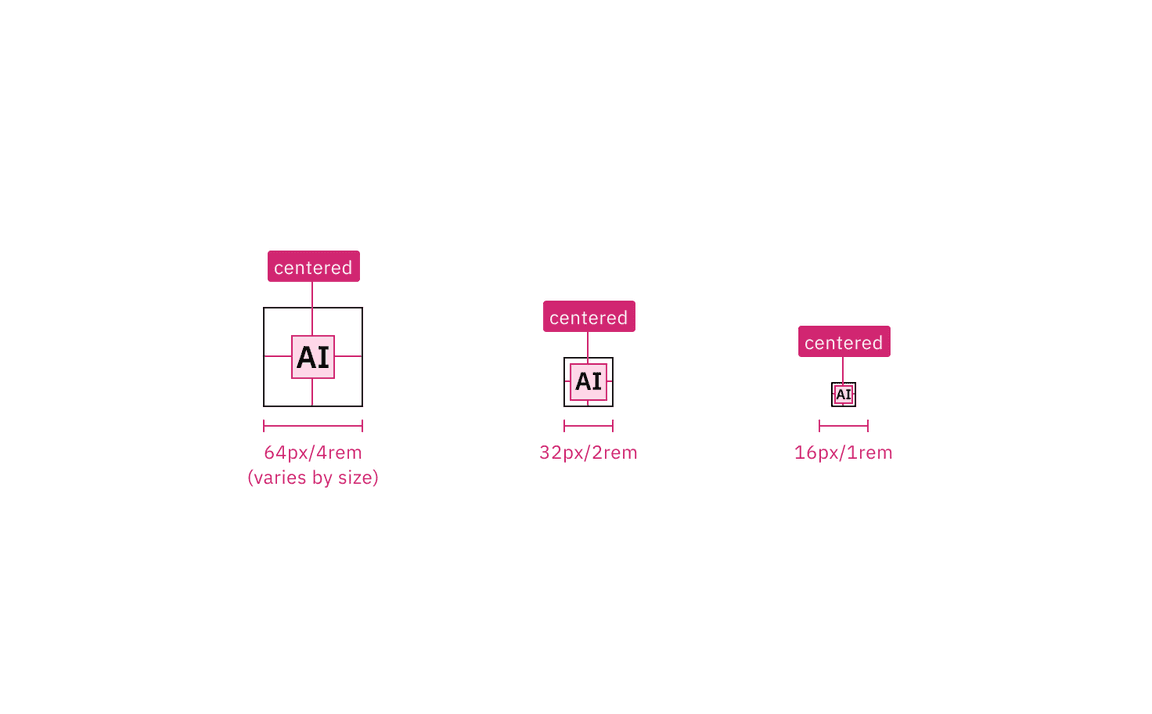
| Default size | Height (px/rem) |
|---|
| Mini | 16 / 1 |
| 2x small (2xs) | 20 / 1.25 |
| Extra small (xs) | 24 / 1.5 |
| Small (sm) | 32 / 2 |
| Medium (md) | 40 / 2.5 |
| Large (lg) | 48 / 3 |
| Extra large (xl) | 64 / 4 |
| Inline size | Height (px/rem) |
|---|
| Small (sm) | 16 / 1 |
| Medium (md) | 18 / 1.125 |
| Large (lg) | 22 / 1.375 |